| Search |
NEXT -> Responsive Web Design - Media Queries
Responsive Web Design - Grid-View
What is a Grid-View?
Many web pages are based on a grid-view, which means that the page is divided into columns:

Using a grid-view is very helpful when designing web pages. It makes it easier to place elements on the page.
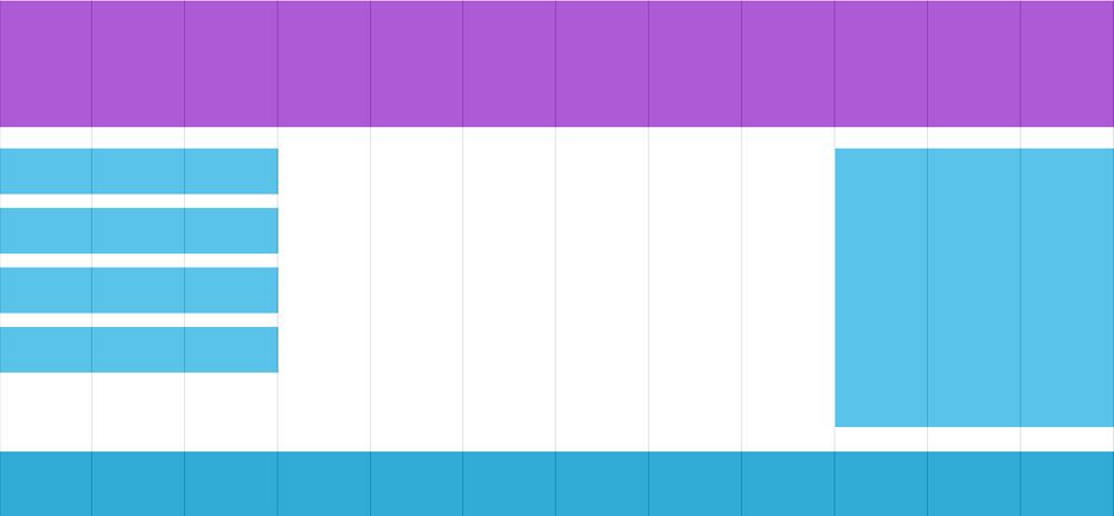
A responsive grid-view often has 12 columns, and has a total width of 100%, and will shrink and expand as you resize the browser window.
Building a Responsive Grid-View
Lets start building a responsive grid-view.
First ensure that all HTML elements have the box-sizing property set to border-box. This makes sure that the padding and border are included in the total width and height of the elements.
Add the following code in your CSS:
* {
box-sizing: border-box;}
The following example shows a simple responsive web page, with two columns:
Example
.menu {
width: 25%;
float: left;
}
.main {
width: 75%;
float: left;
The example above is fine if the web page only contains two columns. However, we want to use a responsive grid-view with 12 columns, to have more control over the web page.
NEXT -> Responsive Web Design - Media Queries
CONTENT (step-by-step)
ACCOUNT SETTINGS
WEBSITE SETTINGS
Google Analytics and other Scripts
NAVIGATION
CONTENT
IMAGES
MEDIA
PLUGINS
Expandable / Collapsible Block
VIDEOS