| Search |
NEXT -> Responsive Web Design - Images
Responsive Web Design - Media Queries
What is a Media Query?
Media query is a CSS technique introduced in CSS3.
It uses the @media rule to include a block of CSS properties only if a certain condition is true.
Example
If the browser window is 600px or smaller, the background color will be lightblue:
@media only screen and (max-width: 600px) {
body {
background-color: lightblue;
}
Add a Breakpoint
Earlier in this tutorial we made a web page with rows and columns, and it was responsive, but it did not look good on a small screen.
Media queries can help with that. We can add a breakpoint where certain parts of the design will behave differently on each side of the breakpoint.
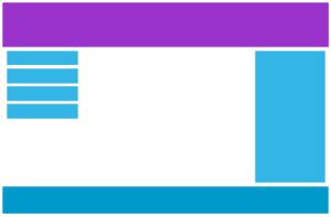
Desktop
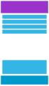
Phone
Use a media query to add a breakpoint at 768px:
Example
When the screen (browser window) gets smaller than 768px, each column should have a width of 100%:
/* For desktop: */
.col-1 {width: 8.33%;}
.col-2 {width: 16.66%;}
.col-3 {width: 25%;}
.col-4 {width: 33.33%;}
.col-5 {width: 41.66%;}
.col-6 {width: 50%;}
.col-7 {width: 58.33%;}
.col-8 {width: 66.66%;}
.col-9 {width: 75%;}
.col-10 {width: 83.33%;}
.col-11 {width: 91.66%;}
.col-12 {width: 100%;}
@media only screen and (max-width: 768px) {
/* For mobile phones: */
[class*="col-"] {
width: 100%;
}
}
Always Design for Mobile First
Mobile First means designing for mobile before designing for desktop or any other device (This will make the page display faster on smaller devices).
This means that we must make some changes in our CSS.
NEXT -> Responsive Web Design - Images
CONTENT (step-by-step)
ACCOUNT SETTINGS
WEBSITE SETTINGS
Google Analytics and other Scripts
NAVIGATION
CONTENT
IMAGES
MEDIA
PLUGINS
Expandable / Collapsible Block
VIDEOS